The creative challenge
Give a packaging concept a distinctive presence while keeping the supporting campaign visuals connected. Form, color, and texture need to create a recognizable family of images.
Packaging design / DESIGN CONCEPT
Packaging with presence. A visual system with energy.
An expressive packaging and campaign study built around saturated orange, material texture, and bold product presentation.

Visual source: Ariyana Studio template concept. Presented as a visual design study.
01 / WORK OVERVIEW
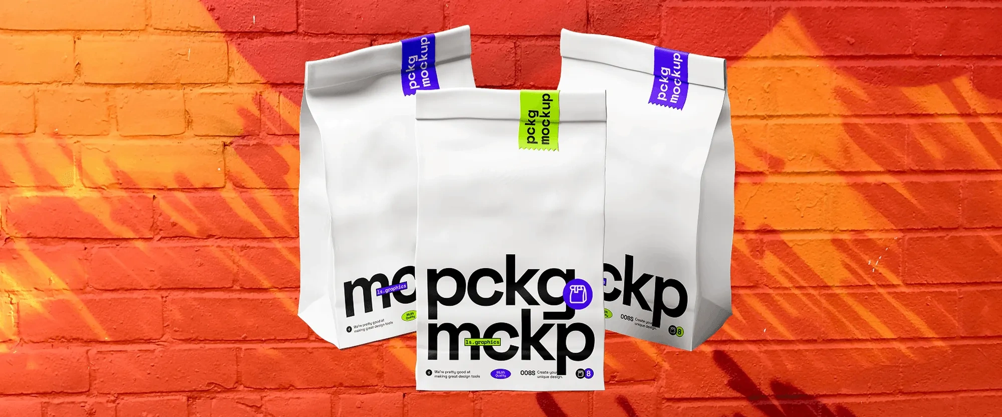
Push Past Pack brings packaging presentation and campaign art direction into a vivid visual study. Orange-led compositions, sculptural surfaces, and a grouped packaging mockup explore how a strong identity can extend across different visual settings.
Give a packaging concept a distinctive presence while keeping the supporting campaign visuals connected. Form, color, and texture need to create a recognizable family of images.
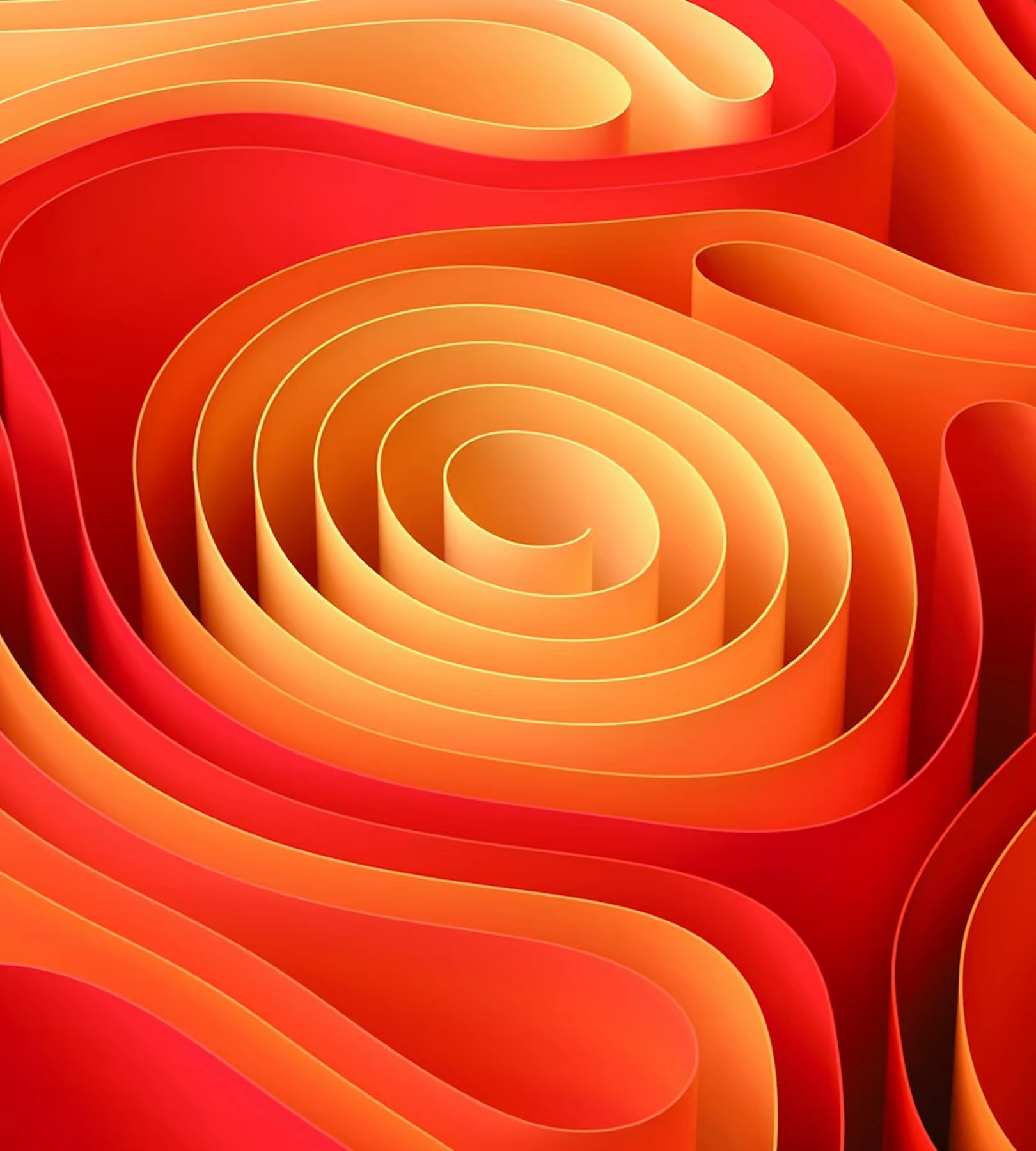
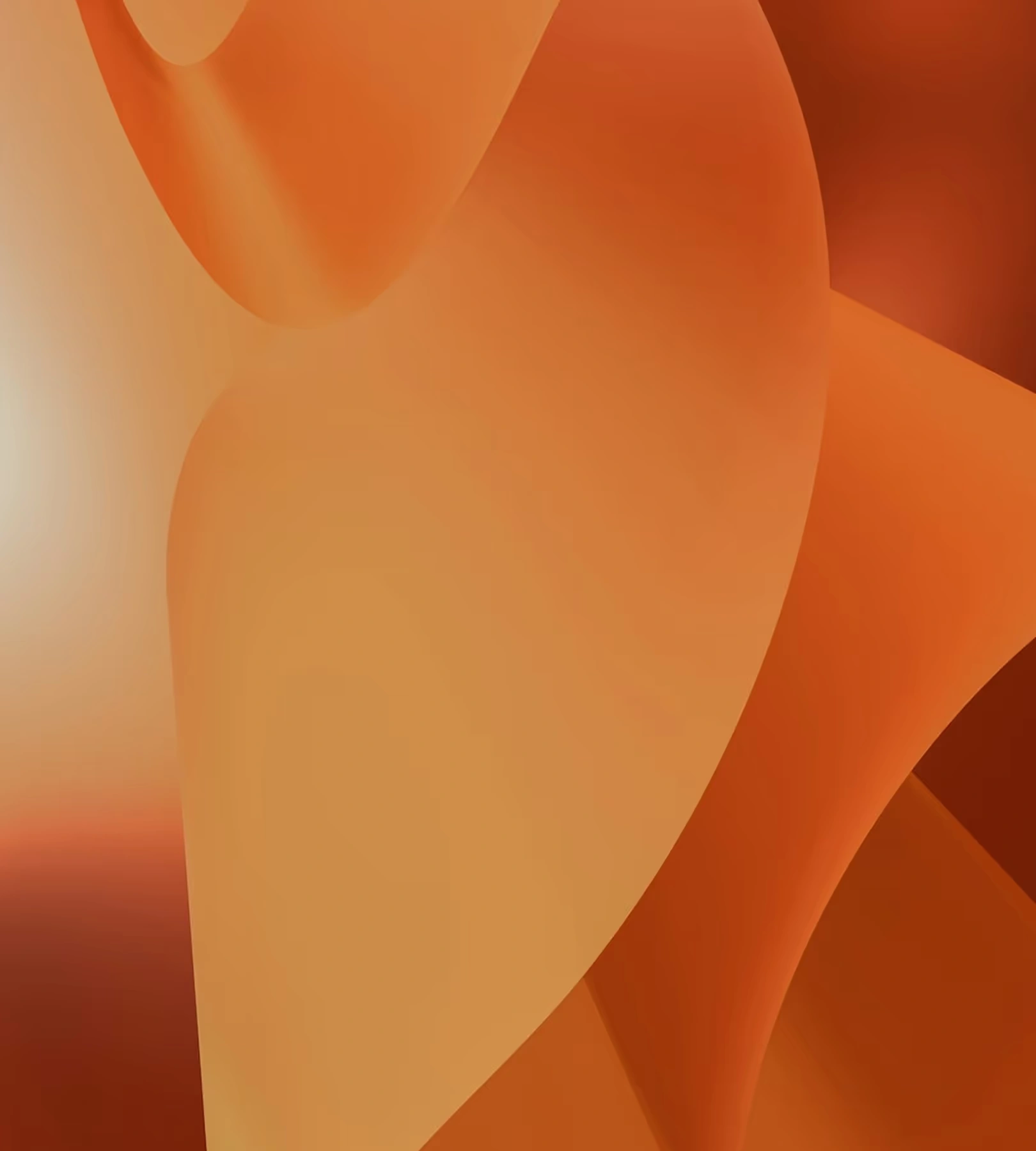
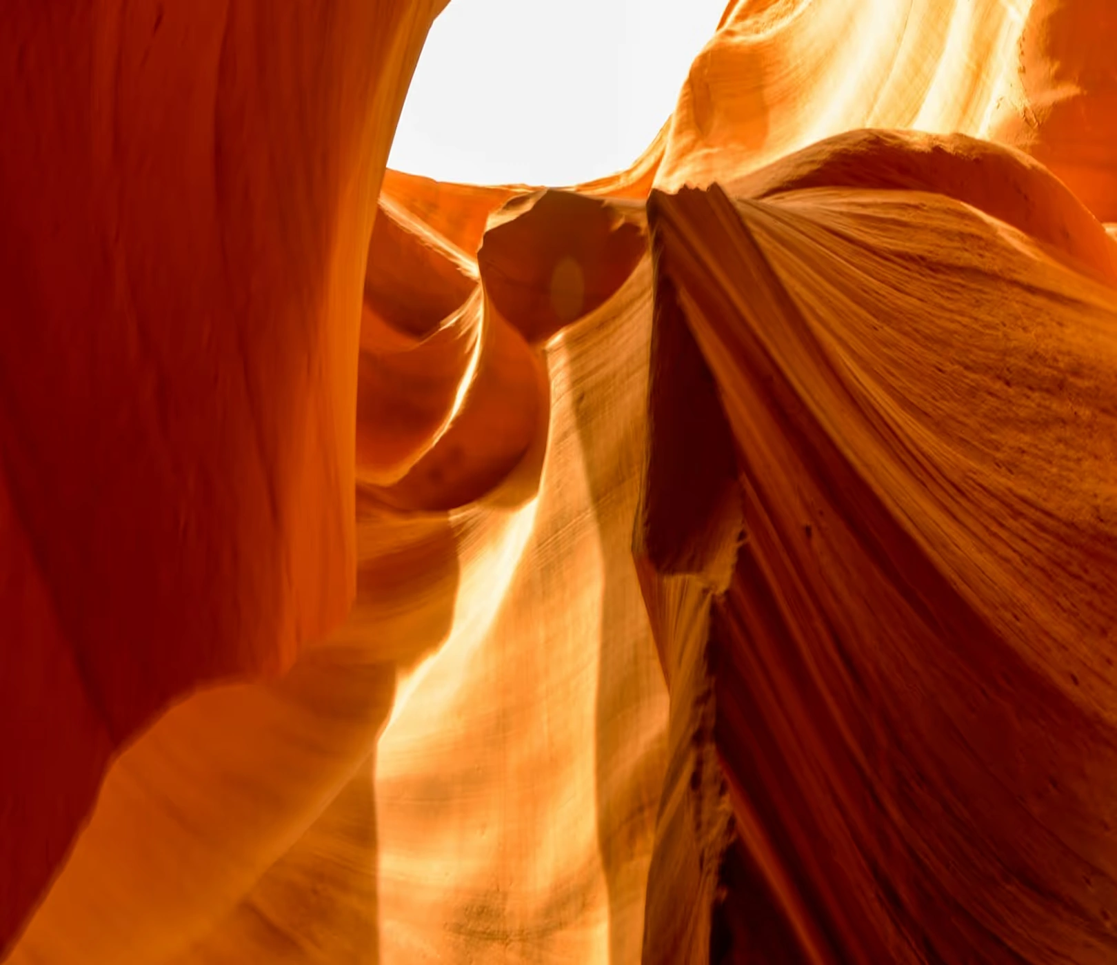
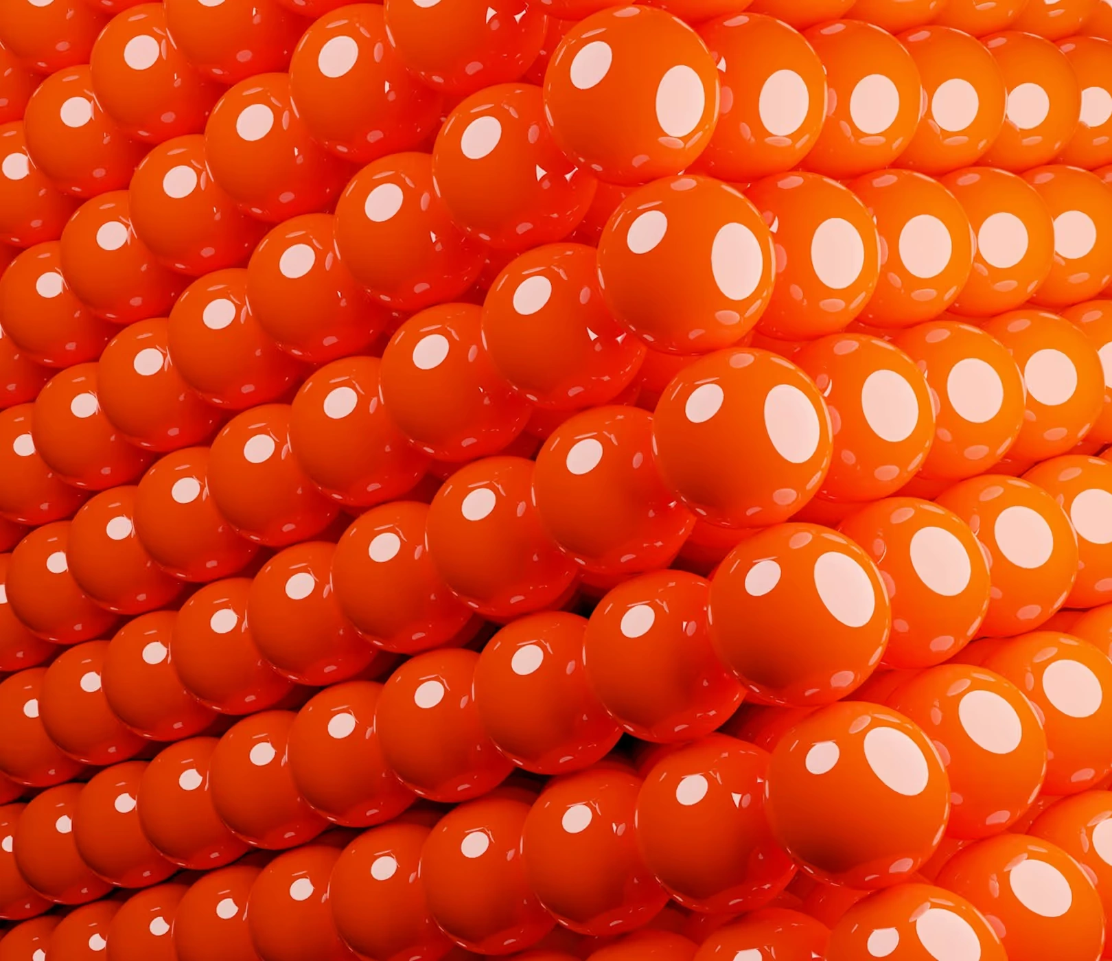
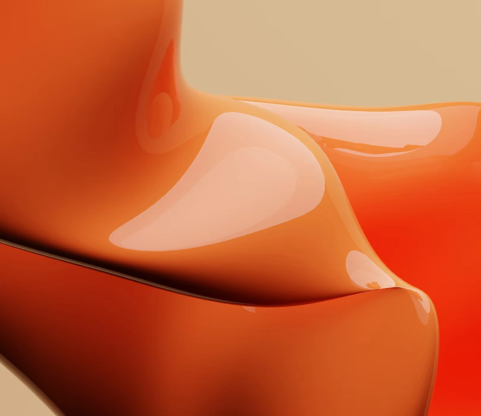
Saturated orange acts as a shared visual anchor. Layered materials, directional light, and close-up textures add variety without losing the overall identity.
02 / CREATIVE DIRECTION
The supplied mockups place the packaging identity in a focused, high-impact composition.
A consistent orange direction creates continuity between the different visual studies.
Fabric, sculptural surfaces, and tactile forms develop the campaign’s supporting language.
The collection moves between product presentation, abstract form, and detailed texture.
03 / VISUAL EXPLORATION
A closer look at the supplied compositions, materials, and applications.
PROJECT CONTEXT
An expressive packaging and campaign study built around saturated orange, material texture, and bold product presentation.
Illustrative figures from the supplied concept brief.
NEXT VISUAL STUDY
A payment-brand visual study combining a symbol presentation, device imagery, and cool-toned dimensional compositions.
LET’S FIND YOUR STARTING POINT
Your idea. Our next conversation.
Book a discovery call