
The creative challenge
Establish a visual identity that feels distinctive in a digital context. The symbol and supporting art direction need to share a clear, consistent character.
Brand identity / DESIGN CONCEPT
A clear identity for a digital payment experience.
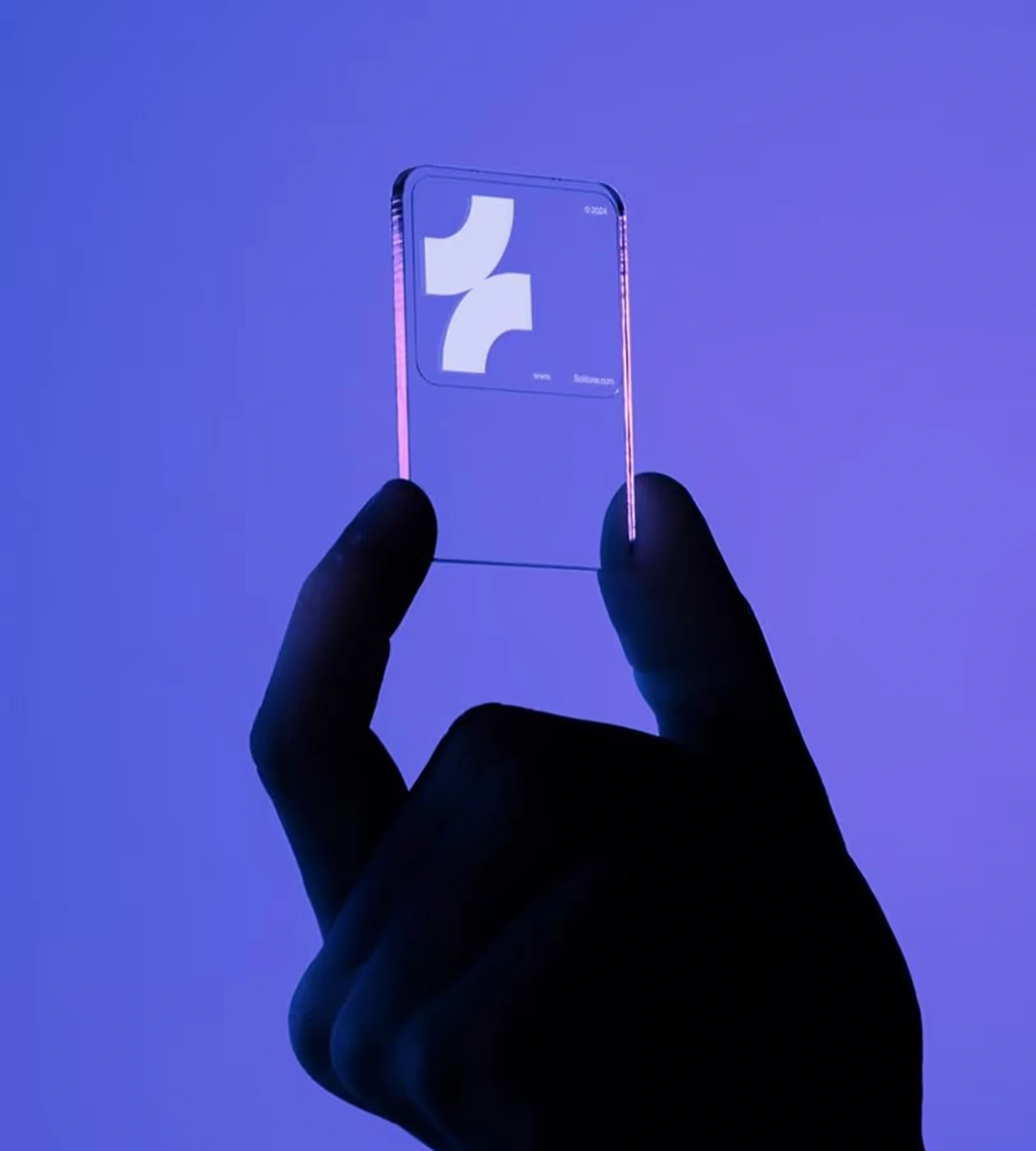
A payment-brand visual study combining a symbol presentation, device imagery, and cool-toned dimensional compositions.

Visual source: Ariyana Studio template concept. Presented as a visual design study.
01 / WORK OVERVIEW
This payment identity study explores how a digital brand can feel recognizable across symbol, screen, and environment. The supplied imagery combines a handheld device presentation with a family of blue, violet, and green dimensional forms.
Establish a visual identity that feels distinctive in a digital context. The symbol and supporting art direction need to share a clear, consistent character.
A cool palette, geometric compositions, and a device-centered symbol presentation create the visual foundation. Rounded forms provide a softer counterpart to the structured identity treatment.
02 / CREATIVE DIRECTION
The mark is shown within a focused handheld-device composition.
Mobile imagery connects the identity with its intended screen-based setting.
Geometric and rounded forms establish a repeatable supporting visual vocabulary.
Blue, violet, and green treatments show variations within the supplied art direction.
03 / VISUAL EXPLORATION
A closer look at the supplied compositions, materials, and applications.





PROJECT CONTEXT
A payment-brand visual study combining a symbol presentation, device imagery, and cool-toned dimensional compositions.
Illustrative figures from the supplied concept brief.
NEXT VISUAL STUDY
A WordPress-oriented website concept with vivid product imagery, expressive typography, and a playful digital presentation.
LET’S FIND YOUR STARTING POINT
Your idea. Our next conversation.
Book a discovery call